
 笹川(エンジニア)
【Android】Webでよくみる入力Boxを手作り
笹川(エンジニア)IT技術
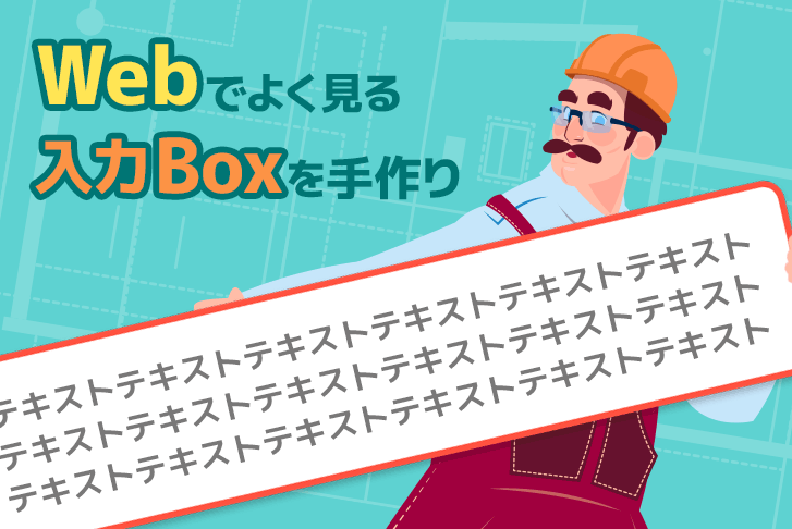
Webでよくみる入力Boxを手作り
(株)ライトコードでモバイルアプリケーション開発をしている笹川(ささがわ)です!
今日は様々なWebページで見かける入力フォームにある入力Boxを2つのパターンで作っていきたいと思います!

シンプルな入力Boxを作りたい場合はTextInputLayoutを使おう!
TextInputLayoutとはMaterial DesignのText Fieldsを実現できるレイアウトです
導入、カスタマイズのの仕方は調べればすぐにわかると思うのでここでは割愛しますね
自分で作りたい場合はCustomViewを作ろう!
ここからがメインです
フォームは様々な例がありますが、今回は「枠線」「文字数制限」「エラー表示」を対応したものを作ります

まずはレイアウトを先に組み上げます
今回はLinearLayoutとAppCompatEditTextとTextViewの3つを使って作ります
1<?xml version="1.0" encoding="utf-8"?>
2<layout>
3
4    <LinearLayout xmlns:android="http://schemas.android.com/apk/res/android"
5        xmlns:app="http://schemas.android.com/apk/res-auto"
6        xmlns:tools="http://schemas.android.com/tools"
7        android:id="@+id/frame"
8        android:layout_width="match_parent"
9        android:layout_height="match_parent"
10        android:layout_weight="65"
11        android:background="@drawable/input_text_border"
12        android:orientation="vertical"
13        android:padding="1dp"
14        app:layout_constraintBottom_toBottomOf="parent"
15        app:layout_constraintLeft_toLeftOf="parent"
16        app:layout_constraintRight_toRightOf="parent"
17        app:layout_constraintTop_toTopOf="parent">
18
19        <androidx.appcompat.widget.AppCompatEditText
20            android:id="@+id/edit_text"
21            android:layout_width="match_parent"
22            android:layout_height="0dp"
23            android:layout_marginTop="12dp"
24            android:layout_marginBottom="12dp"
25            android:layout_weight="1"
26            android:background="@color/white"
27            android:gravity="start|center_vertical"
28            android:paddingStart="16dp"
29            android:paddingEnd="16dp"
30            android:textSize="14sp"
31            tools:hint="メールアドレス"
32            tools:text="" />
33
34        <TextView
35            android:id="@+id/error_text_title"
36            android:layout_width="match_parent"
37            android:layout_height="20dp"
38            android:background="@color/highlight_red"
39            android:gravity="center"
40            android:padding="2dp"
41            android:text="100文字以内で入力"
42            android:textColor="@color/error"
43            android:textSize="11sp"
44            android:textStyle="bold"
45            android:visibility="gone"
46            tools:visibility="visible" />
47
48    </LinearLayout>
49</layout>
ボーダーに関しては下記をLinearLayoutの背景に指定しています
1<?xml version="1.0" encoding="utf-8"?>
2<selector xmlns:android="http://schemas.android.com/apk/res/android">
3
4    <item android:state_enabled="true" android:state_hovered="false" android:state_selected="false">
5        <shape android:shape="rectangle">
6
7            <solid android:color="@android:color/white" />
8            <stroke android:width="1dp" android:color="@color/high_light" />
9        </shape>
10    </item>
11
12    <item android:state_enabled="false" android:state_hovered="false" android:state_selected="false">
13        <shape android:shape="rectangle">
14
15            <solid android:color="@android:color/white" />
16            <stroke android:width="1dp" android:color="@color/white" />
17        </shape>
18    </item>
19
20    <item android:state_selected="true">
21        <shape android:shape="rectangle">
22
23            <solid android:color="@android:color/white" />
24            <stroke android:width="1dp" android:color="@color/error" />
25        </shape>
26    </item>
27
28    <item android:state_hovered="true">
29        <shape android:shape="rectangle">
30
31            <solid android:color="@android:color/white" />
32            <stroke android:width="1dp" android:color="@color/error" />
33        </shape>
34    </item>
35
36</selector>
フォーカスのON/OFFとエラー状態によってボーダーの色を変えるようにしています
stateの変更はKotlin/Java側で対応が必要です(先ほどLinearLayoutでIDを指定したのはこのためです
CustomViewクラスはこんな感じになります
1package com.example.exampleinputtext
2
3import android.annotation.SuppressLint
4import android.content.Context
5import android.text.Editable
6import android.text.Spannable
7import android.text.style.ForegroundColorSpan
8import android.util.AttributeSet
9import android.view.KeyEvent
10import android.view.LayoutInflater
11import android.view.View
12import android.view.ViewGroup
13import android.widget.TextView
14import androidx.constraintlayout.widget.ConstraintLayout
15import androidx.core.content.ContextCompat
16import androidx.core.widget.doAfterTextChanged
17import com.example.exampleinputtext.databinding.InputTextViewBinding
18
19class InputTextView : ConstraintLayout {
20    lateinit var binding: InputTextViewBinding
21
22    /* 入力された文字 */
23    var inputText: String
24        set(value) {
25            binding.editText.setText(value)
26            updateBorderColor(false, errorLength, inputText, binding.frame, binding.errorText)
27            resizeHeight()
28        }
29        get() = binding.editText.text?.toString() ?: ""
30
31    /** 最大文字数 */
32    var errorLength: Int = 100
33
34    /** 現在の行数 最低でも1になる */
35    private val lineCount: Int
36        get() = if (binding.editText.lineCount > 0) binding.editText.lineCount else 1
37
38    private val margin: Int
39        get() {
40            val errorHeight = if (binding.errorText.visibility == View.VISIBLE) {
41                getDimensionPixelSize(R.dimen.input_text_error_height)
42            } else {
43                0
44            }
45            return getDimensionPixelSize(R.dimen.space_28dp) + errorHeight
46        }
47
48    private val lineHeight: Int
49        get() = (lineCount * getDimensionPixelSize(R.dimen.input_text_line_height)) + margin
50
51    constructor(context: Context) : super(context) {
52        init(null, 0)
53    }
54
55    constructor(context: Context, attrs: AttributeSet) : super(context, attrs) {
56        init(attrs, 0)
57    }
58
59    constructor(context: Context, attrs: AttributeSet, defStyle: Int) : super(context, attrs, defStyle) {
60        init(attrs, defStyle)
61    }
62
63    override fun onFinishInflate() {
64        super.onFinishInflate()
65        setListener()
66    }
67
68    override fun dispatchKeyEventPreIme(event: KeyEvent?): Boolean {
69        // フォーム外タップはキーボード閉じる
70        if (event?.keyCode == KeyEvent.KEYCODE_BACK && event.action == KeyEvent.ACTION_UP) {
71            closedKeyboard()
72        }
73        return super.dispatchKeyEventPreIme(event)
74    }
75
76    @SuppressLint("CustomViewStyleable")
77    fun init(attributeSet: AttributeSet?, defStyle: Int) {
78        binding = InputTextViewBinding.inflate(LayoutInflater.from(context), this, true)
79        // エラー文字数や各種初期定義はstyleで受け取ってここで定義の方がスマート
80    }
81
82    private fun setListener() {
83        binding.editText.setOnFocusChangeListener { _, hasFocus ->
84            updateBorderColor(
85                hasFocus = hasFocus,
86                errorLength = errorLength,
87                inputText = inputText,
88                frame = binding.frame,
89                errorText = binding.errorText
90            )
91            updateTextColor(binding.editText.text, errorLength)
92            resizeHeight()
93        }
94        binding.editText.doAfterTextChanged {
95            if (!binding.editText.isEnabled) return@doAfterTextChanged
96            updateBorderColor(
97                errorLength = errorLength,
98                inputText = inputText,
99                frame = binding.frame,
100                errorText = binding.errorText
101            )
102            updateTextColor(it, errorLength)
103            resizeHeight()
104        }
105    }
106
107    private fun updateTextColor(inputText: Editable?, errorLength: Int) {
108        if (inputText == null || inputText.isEmpty()) return
109
110        val start = if (inputText.length > errorLength) errorLength else 0
111        val color = if (inputText.length > errorLength) R.color.error else R.color.black
112
113        if (start >= inputText.length) return
114
115        inputText.setSpan(
116            ForegroundColorSpan(ContextCompat.getColor(context, color)),
117            start, inputText.length, Spannable.SPAN_EXCLUSIVE_EXCLUSIVE
118        )
119    }
120
121    private fun closedKeyboard() {
122        updateBorderColor(false, errorLength, inputText, binding.frame, binding.errorText)
123        binding.editText.clearFocus()
124    }
125
126    private fun updateBorderColor(hasFocus: Boolean = true, errorLength: Int, inputText: String, frame: ViewGroup, errorText: TextView) {
127        val isLengthError = inputText.length > errorLength
128
129        frame.isSelected = isLengthError
130        frame.isEnabled = hasFocus
131
132        errorText.visibility = if (isLengthError && hasFocus) View.VISIBLE else View.GONE
133    }
134
135    private fun resizeHeight() {
136        if (measuredHeight == 0) return
137        // EditTextをwrapしているので、高さは自分でリサイズしていく必要がある
138        layoutParams.height = lineHeight + (getDimensionPixelSize(R.dimen.line_1dp) * 2)
139        requestLayout()
140    }
141
142    private fun getDimensionPixelSize(res: Int): Int = context.resources.getDimensionPixelSize(res)
143}
今回のようなEditTextをwrapするような形で作ると改行等による高さ調整が自動でできなくなります
そうなると使い勝手が悪いので文字入力やフォーカス変更のタイミングで高さ調整がされるように実装しています
また文字数制限を実装していますが、入力制限ではなくエラー表示と文字色の変更、ボーダーカラーの変更でエラーを表現しています
Androidでは文字数制限を簡単に実装できますが、今回のようなフォームではコピー&ペーストで入力されることも考慮して制限をいれません
使いたい画面に設定
先ほど作成したクラスを使いたい画面のlayout.xmlに定義します
1    <androidx.constraintlayout.widget.ConstraintLayout
2        android:layout_width="match_parent"
3        android:layout_height="match_parent"
4        tools:context=".MainActivity">
5
6        <com.example.exampleinputtext.InputTextView
7            android:id="@+id/input_view"
8            android:layout_width="match_parent"
9            android:layout_height="wrap_content"
10            android:layout_marginTop="32dp"
11            android:paddingStart="16dp"
12            android:paddingEnd="16dp"
13            app:layout_constraintLeft_toLeftOf="parent"
14            app:layout_constraintRight_toRightOf="parent"
15            app:layout_constraintTop_toTopOf="parent" />
16
17    </androidx.constraintlayout.widget.ConstraintLayout>
サンプル
こちらのリポジトリにサンプルを置いておきますので参考にどうぞ
これでアプリを実行しますとこのような感じになります!


ライトコードでは、エンジニアを積極採用中!
ライトコードでは、エンジニアを積極採用しています!カジュアル面談等もございますので、くわしくは採用情報をご確認ください。
採用情報へ

新潟生まれ新潟育ち本業はモバイルアプリエンジニア。 日々、猫(犬)エンジニアとして活躍中!


